3Down
University of Manitoba Bisons undergo rebrand, unveil new logo
The University of Manitoba Bisons have a new look as the school has unveiled fresh branding and a new logo for their sports teams.
The new emblem features a forward-facing bison that is primarily brown and gold with white and blue accents. Though not a traditional Bisons colour, blue was added to the University of Manitoba’s logo in back 2019. According to the school, it has been added here “to ensure visual cohesion with the university’s broader brand.”
“We are proud to reveal the refreshed look for this next chapter of Bison Sports history,” said school president Michael Benarroch in a statement. “In the same way our student-athletes continue to redefine what success looks like, both on the fields of play and in their communities, we wanted a redefined look that encompasses the legacy of the Bisons while reflecting the vibrancy of our future.”
According to a press release, the rebrand commenced in 2024 and included consultation with student-athletes, coaches, volunteers, parents, recreation services members, members of the Indigenous community, and others. The same release said all student-athletes would don the new logo for 2025-2026, though the football team will not adapt it until 2026-2027, as per 3DownNation reporter John Hodge.
The Bisons lost their first football game of the 2025 season last week, dropping a 21-9 matchup to the UBC Thunderbirds. The team will return to the field on Friday, September 5 when they visit the Calgary Dinos.
Manitoba is the latest of several programs to recently undergo rebrands, including the Regina Rams and McGill Redbirds.
Below is a graphic that illustrates the history of Manitoba Bisons logos.

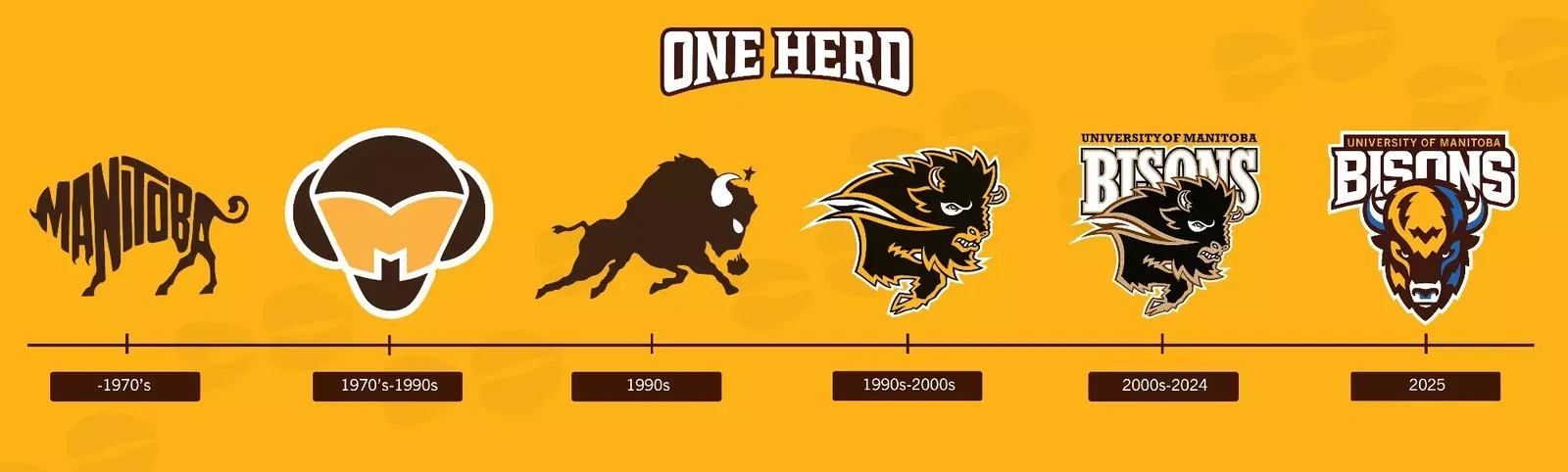
Photo: Manitoba Bisons