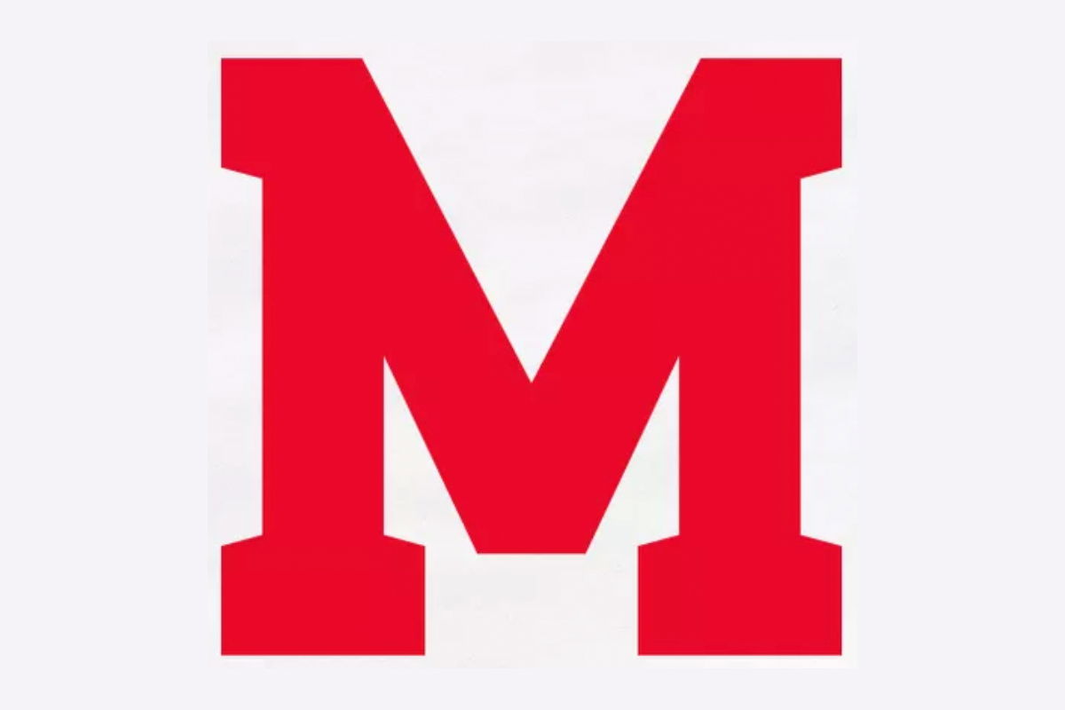
The McGill Redbirds have unveiled a new (and old) logo for their varsity teams.
The logo — a red ‘M’ — is intended to pay homage to the branding first worn my McGill’s student-athletes in 1898.
According to the school, the “rebranding marks a new chapter for McGill’s athletic program, inviting alumni, students, and supporters alike to rally behind a shared visual identity rooted in excellence and legacy.”
“We’re proud to reintroduce a symbol that connects today’s Redbirds and Martlets to more than a century of McGill Athletics history,” said Geoffrey Phillips, the school’s executive director of athletics and recreation, in a statement. “This isn’t just a logo — it’s a celebration of identity, community, and tradition.”
The school indicated that the new logo will appear across all varsity uniforms, merchandise, and promotional materials beginning this fall.
McGill’s old logo featured a red ‘M’ emblazoned with the school’s crest. 3DownNation previously named it the No. 15-ranked logo in all of U Sports football.
The Redbirds finished third in the RSEQ standings this past season at 3-5. The team was defeated 42-3 by the Montreal Carabins in the semifinal round.
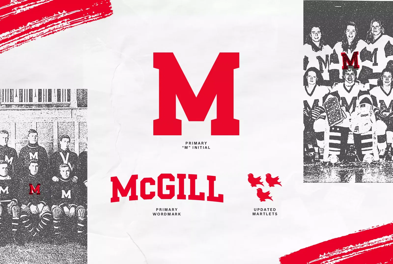
Photo: McGill